Troverse
TroVerse was an exploratory proof-of-concept for an information discovery application built on MetaCarta, Qbase, and Solr. The application connected to a framework for pulling data from different enterprise document repositories such as file systems, Sharepoint, Documentum, or relational databases.
© 2015 Synthos Technologies


Summary
The target clients were in the intelligence community and energy industry, both long-time users of MetaCarta. TroVerse was part of an end-to-end document structuring and discovery solution for both savvy and unsavvy technology users.
Over the course of the project, I researched, analyzed, and designed for information-seeking patterns across a spectrum of users’ technical skills. I also designed tools that offered both shallow and enriched interactions with surfaced information. One of the most creatively challenging aspects of TroVerse was exploring how our typical interactions with map-based applications could be adapted to information search and discovery. The second aspect was to create a complex, user-friendly search experience that encouraged exploration beyond the keyword search box.
Branding
The final UI adhered closely to the brand style guide creating by the marketing team.
Tools
The prototype was created using the UX design application Sketch. InVision was used for marketing presentations.

Document detail dialog box
“Of all the products taken to market, TroVerse is ‘the hero.”
Stats
4 months or 8 sprints from UX start to product release
5 initial layout ideas
85 wireframes
4 core features + 6 supporting features
58 prototype screens
12 pages of design specs
UX/UI Inspiration
Mapbox
CartoDB
Google Maps Engine
Open Street Maps
ESRI
news.google.com
intotheartic.ca
Pocket Tagging


TroVerse v.2 boundary drawing tool.
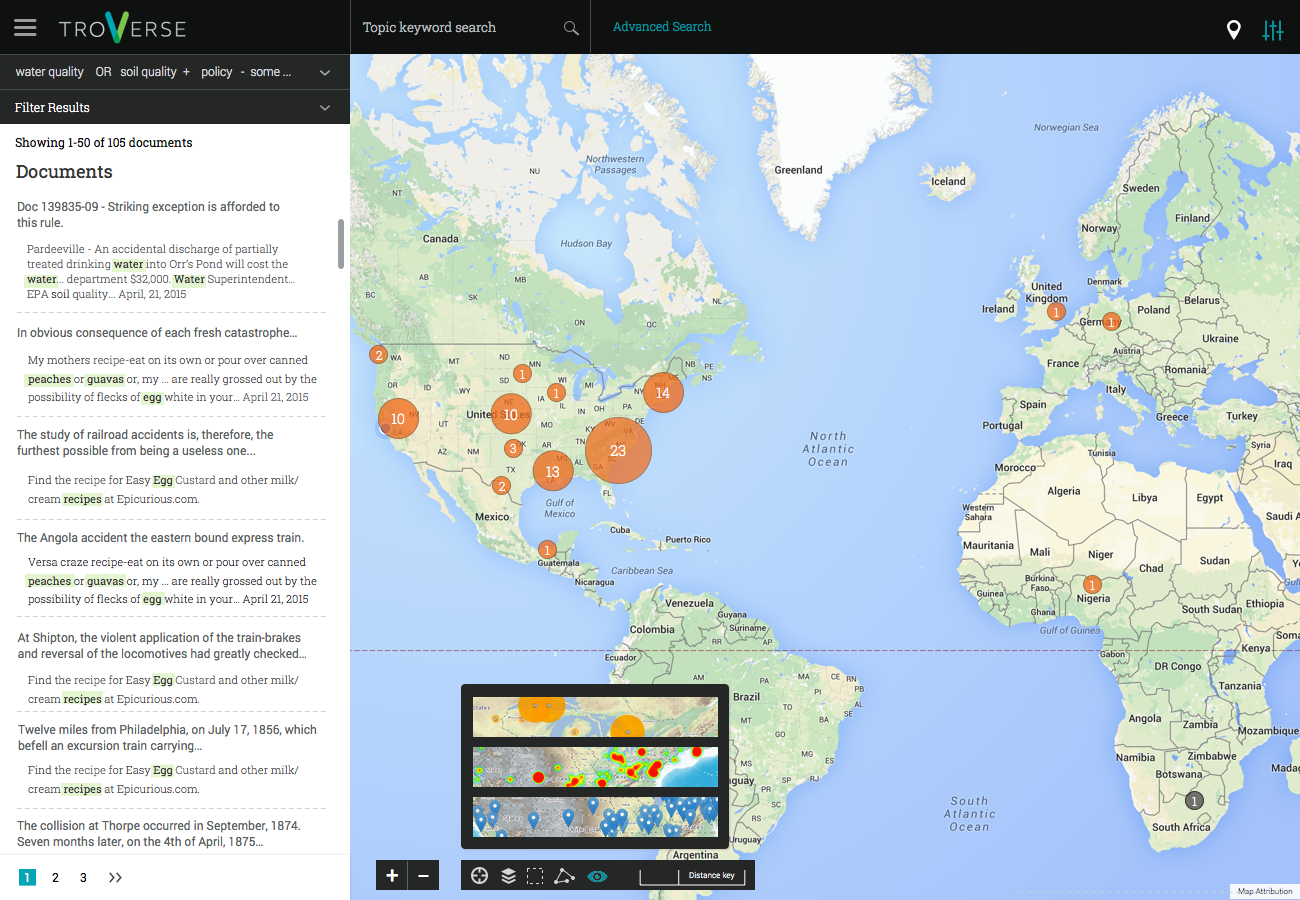
Search
Document discovery is the core purpose of TroVerse. Search functionality needed to include the full suite of tools: keyword, Boolean strings, faceting, and filtering via map interactions. In designing the search interface and task flow, I drew on my expertise as a librarian and six years of using top research databases and other information discovery applications.
(unicorns AND california) OR (“magic horses” AND nebraska) NOT rhinosaures

Query building panel

Faceting by geographic location.

Location search panel

Saved documents panel
Hallway testing
There were limited opportunities of user testing in given the tight MVP deadline. Additionally, network security prevented user accessibility to the living application. Static testing via Usability Hub or UserTesting was out of the question due to the complex feedback loops in the application. To overcome this, I conducted “hallway testing” with fellow colleagues. Using screen-sharing, I gave them tasks and observed as they completed them while vocalizing their thought process. Early sessions were conducted with users with novice search skills and showed major design weaknesses. These translated into more friendly task flows, like the query builder panel.
“I like being able to preview the document before downloading it.”
“Can we make it so that the relevant markers are highlighted on the map when a user hovers over a search result title?”
“Can we add the option to display the results as a heat map?”

Map overlays picker v. 1
Map overlays picker v. 2
Two iterations of map overlays based on user feedback. Users also asked for a simplified screen that gave more screen space to the map interface, leading to v.3 toward the top of this screen.
Agile
With a tight release deadline and an Agile approach, it was critical to have weekly deliverables for the developers to work on. To do this, I started with a very rough outline of what the features were and their layout. Each week’s designs built on the previous week’s, so that by the release date, the app needed only small refinements.

